My demographic based election forecasting model predicts a close race
There are 50 days until the election. But in a year that feels like it will never end, that’s still a long time. Every day until the election, there will be an unlimited stream of polls and pundits pontificating about what they think will happen. Why? Voting is one of our main fundamental rights of being American citizens and the President serves all of us. This year especially, no matter which side you’re on, it feels like the stakes are incredibly high. I thought it would be fun to use my data skills to explore just how complex it is to build an election forecasting model.
Process
Any great model starts with great data. Luckily, when it comes to elections the data is nicely available. For U.S. presidential election historical data, I went to the MIT election lab website. I decided to download election results from 2000-2016 because the electoral college map for all elections before that looked very different from the typical maps we see today. In fact, some people believe that we are on the verge of yet another political landscape shift as states like Texas Arizona, and Georgia are competitive this year for the first time in decades. Finally, to keep things simple and explainable I decided to build a linear regression model that would predict democratic percentage margin of victory as the target variable. So any negative numbers in this column indicate a Republican victory in that state.
Now that I know my target variable, I next had to figure out which data to use to predict it. Previously, I mentioned that Texas, Arizona, and Georgia are competitive for the first time in a while. This is largely due to changing demographics and (especially in Texas) urbanization. Young people in particular are flocking to the big cities in Texas and any state that is more urbanized and has a large young population tends to lean more democratic. According to the Census Bureau, from 2000 to 2018 Georgia has had the largest increase in the share african americans make up of the citizen voting age population. Also, according to the Census Bureau, Georgia is in the top half in the country for the percentage that whites with a college degree make up of both eligible white voters and likely 2020 white voters. These trends are not found in other southern states and whites with college degrees are a group that have trended towards the Democrats in recent years. Finally, Arizona and Texas both have large (and rising) hispanic populations. This is yet another voter group that tends to lean Democratic.
You put all these factors together and it appears like a recipe for the Democrats to be competitive in more states in 2020. However, you have to be careful here because it was widely believed that the same thing would happen in Florida because of the rise in hispanic population but that hasn’t exactly panned out.
So having said all of this, you can see how Demographic information might help us predict elections. To prove this out, I went to data.census.gov and pulled age, gender, and race/ethnicity data for each state from 2000-2016. I separately added median income per state (also from U.S. Census data) and region of the country that the state was in (i.e. West, Northeast, Midwest or South).
So now for each year (2000, 2004, 2008, 2012, and 2016) I created a dataset that had the following features for each state:
- Total percentage of males
- Total percentage of females
- Total percentage of 15-29 year olds (Of course, anyone under the age of 18 can’t vote but the census dataset I used included minors in this age group)
- Total percentage of 30-44 year olds
- Total percentage of 45-64 year olds
- Total percentage of people aged 65 and above
- Total percentage of Whites
- Total percentage of African Americans
- Total percentage of Asians
- Total percentage of Hispanics
- Median income
- Region of the country the state is in
- Democratic margin of victory in the presidential election
Now we’re ready to model.
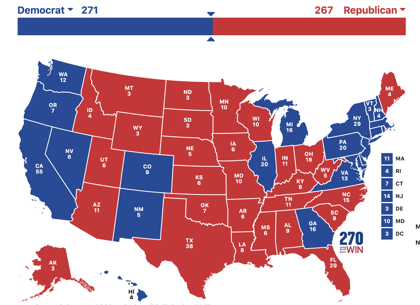
Biden 271 - Trump 267
Ultimately, I decided on a Lasso Regression model because it naturally “removes” features that are not as useful in prediction. Also, it uses regularization to combat overfitting which is a real concern given how few data points there are. The results were an extremely close Biden win (Biden gets 271 electoral votes and Trump gets 267) and an adjusted R squared of 0.798. That means the features I included are accounting for 79.8% of the variability in the target variable.
You can see below the states the model predicted Biden to win and his predicted margin of victory for each one.
| State | Electoral College Votes | Predicted Percentage Margin of Victory for Biden |
|---|---|---|
| District of Columbia | 3 | 92.17% |
| Massachusetts | 11 | 37.20% |
| California | 55 | 35.60% |
| New York | 29 | 32.50% |
| Maryland | 10 | 30.10% |
| Rhode Island | 4 | 28.71% |
| Hawaii | 4 | 26.81% |
| New Jersey | 14 | 26.53% |
| Connecticut | 7 | 24.49% |
| Illinois | 20 | 17.75% |
| Colorado | 9 | 15.62% |
| New Hampshire | 4 | 12.92% |
| Nevada | 6 | 12.07% |
| Washington | 12 | 11.83% |
| Delaware | 3 | 9.64% |
| Oregon | 7 | 8.22% |
| New Mexico | 5 | 6.77% |
| Pennsylvania | 20 | 5.72% |
| Vermont | 3 | 3.82% |
| Georgia | 16 | 0.77% |
| Virginia | 13 | 0.69% |
| Michigan | 16 | 0.45% |
And here are the states that the model predicts Trump to win with his predicted margin of victory for each one:
| State | Electoral College Votes | Predicted Percentage Margin of Victory for Trump |
|---|---|---|
| South Dakota | 3 | 39.99% |
| West Virginia | 5 | 35.26% |
| North Dakota | 3 | 34.03% |
| Utah | 6 | 31.49% |
| Arkansas | 6 | 30.21% |
| Oklahoma | 7 | 30.16% |
| Idaho | 4 | 29.67% |
| Wyoming | 3 | 29.03% |
| Montana | 3 | 26.95% |
| Kentucky | 8 | 26.55% |
| Nebraska | 5 | 22.01% |
| Iowa | 6 | 19.63% |
| Mississippi | 6 | 18.28% |
| Alaska | 3 | 17.20% |
| Louisiana | 8 | 16.53% |
| Kansas | 6 | 16.15% |
| Tennessee | 11 | 14.05% |
| Alabama | 9 | 13.40% |
| South Carolina | 9 | 12.67% |
| Florida | 29 | 8.19% |
| Minnesota | 10 | 7.12% |
| Indiana | 11 | 6.44% |
| North Carolina | 15 | 5.97% |
| Wisconsin | 10 | 5.90% |
| Texas | 38 | 4.35% |
| Missouri | 10 | 4.29% |
| Ohio | 18 | 2.18% |
| Arizona | 11 | 1.59% |
| Maine | 4 | 0.09% |
You can see that the model expects Biden to flip Pennsylvania, Michigan, and Georgia but Trump will flip Minnesota and Maine. Some of these margins look pretty normal. There are definitely some weird results though. For instance, it would be quite a shock to see Trump win Iowa by 19 points or Biden to win New Hampshire by ~13 points given the current polling and previous results. Similarly, the races in Florida, Wisconsin, Minnesota, Pennsylvania and Nevada will probably be a lot closer than predicted here. What’s driving this? Let’s look at the coefficients for the linear regression model to see what features the model is using to predict:
| Features | Coefficient |
|---|---|
| 30-44 year olds | 16.12 |
| 45-64 year olds | 16.11 |
| 15-29 year olds | 10.16 |
| Male population | -8.48 |
| South (yes or no) | -8.12 |
| 65+ age group | 6.85 |
| Whites | -4.33 |
| Asian | 3.54 |
| Hispanics | 3.04 |
| Median Income | 1.37 |
| Midwest region (yes or no) | 0.40 |
| Northeast region (yes or no) | 0.18 |
| Female population | 0.00 |
| African American | 0.00 |
| West region (yes or no) | 0.00 |
Keep in mind, all these features except the regions are the percentage that this group of people represents in the total population of the state.
Takeaways
Gender:
The model has the coefficient of male population at -8.48. This means for every 1% increase in the male population in the state the Democratic margin goes down by 8.48 percentage points. In other words, the Republican margin increases by 8.48 percentage points. This is quite a significant relationship and confirmed by looking at polling data. Men do tend to lean more republican. Unfortunately, the Lasso model chose to exclude the percentage of females because the coefficient value did not have a significant p-value. So we cannot make any claim about the relationship between the percentage of women in a state and which party wins the election.
Race/Ethnicity:
- For every 1% increase in the non-hispanic white population, the democratic margin decreases by 4.33 percentage points
- For every 1% increase in the hispanic population, the democratic margin increases by 3.04 percentage points
- For every 1% increase in the asian population, the democratic margin increases by 3.54 percentage points
- The percentage of african americans feature has been excluded by the lasso model as the p-value was not significant and thus we couldn’t be sure what the relationship was here.
These are all interesting. A larger white population is correlated with better Republican margins and larger hispanic and asian populations are correlated with better Democrat margins. These relationships also seem to be confirmed in recent polling however maybe the relationships aren’t as large as we might have thought. It’s disappointing that there was no relationship found with the percentage of african americans in a state. One possible answer for this can be found by looking at the states with the highest percentage of african americans in the population. The top 5 states/territories in order are: D.C., Mississippi, Louisiana, Georgia and Maryland. Right away you can see why the model would be confused on the effect of the african american population. Democrats have won D.C. and Maryland with huge margins in the last couple decades. On the other hand, Republicans have won Mississippi, Louisiana, and Georgia with high margins in the last couple decades. Only Georgia is getting close to a swing state but as we discussed that’s for more reasons than just the african american population. This is why we don’t just predict with one feature. Elections (and humans) are way more complex than that.
Age:
This one is strange. All age groups that are relevant to voting seem to be correlated with higher democratic margin. For instance, let’s take the 30-44 year old age group. The model is saying for an increase in 1% of 30-44 year olds, the expected democratic margin is expected to increase by 16 percentage points! That seems odd by itself. However, I think the main giveaway that these are fishy results is that all age groups have high positive coefficients. This could be showing a con of using a linear regression model. The model is looking for linear relationships where there aren’t any. You could make a claim that older voters tend to lean more Republican than the other groups because that feature’s coefficient is the lowest of the age groups. But, I think it’s best to assume that this model does not let us make any claims about the relationship between age groups and which party is expected to win.
Median Income:
To match the rest of the features which are formatted as percentages, I chose to represent this feature for each state as their median income divided by the U.S. median income. So this is showing how each state does in comparison the median country value. Here for every 1% increase in median income, the democratic margin increased by 1.37 percentage points. This effect is small but this would be considered surprising just a decade or two ago. Traditionally, the Democrats have been the party of the labor unions and thus attracted lower income blue collar workers. While, Republicans did better with college-educated white collar workers. However, this trend appears to be reversing in recent years as I mentioned above.
Region:
The big takeaway here is if a state is in the South, the democratic margin decreases by 8.12 percentage points. This is not a big surprise to anyone following politics over the last few decades. However, none of the other regions had any significant relationship with who wins the state’s elections.
Learnings
So from this process, what have I learned about election forecast modeling?
- Election forecasting is inherently difficult. There is very little data (we have only had 58 presidential elections in total!), and lots can change in between elections so we are always behind on the trends. In other words, we only confirm hypotheses every 4 years.
- It’s so easy to just add as many features as humanly possible just to see what sticks. Also, the more features you add the higher your R squared. That’s why I’ve used adjusted R squared.
- Overfitting is an easy trap to fall into. It can be very tempting to try to make a model that would have perfectly predicted a previous election. However, that is doing the model a disservice. For instance, I noticed that in the test sample, one of the incorrectly predicted states was Indiana in 2008 when Barack Obama defeated John McCain. That was the first time that Indiana had voted Democrat since 1964. In fact from the 1940 election to the present, the state has only voted Democrat those two times. So you can see why the model predicted Indiana to go Republican in 2008 and that was probably the right call given the history and demographics. You actually want your model to make that mistake.
Overfitting is especially easy to do because data scientists (myself included) often try to simply maximize whatever scoring metric they are using. You’ll add any data that makes the R squared higher and pick the model that similarly gets the highest R squared. Of course, I’m not saying the scoring metric does not matter. You obviously want to keep the scoring metric in mind because it lets you know how accurate the model is. However, you want to make decisions on what features to add based on educated hypotheses about which factors have the biggest impact on an election. That takes real domain expertise.
My hypothesis is that demographics can give us a lot of info on future election results. But it’s not the whole story. It’s probably not even 79.8% of the story as my adjusted R squared figure would claim. In fact, there’s a very good chance that my model is overfit and is not explaining a good portion of the variance in the dependent variable. For instance, here are two things that this model does not account for:
- It does not tell us how current events will impact this election. This year feels like the opposite of business as usual and that will naturally affect the election too. How will COVID-19 play a part for the winner? How will millions of lost jobs, the wildfires on the west coast, and the racial injustice protests affect the election? These questions are not answered by this model.
- Similarly, this model does not take the polls into account. Thus, some margin predictions look really weird if you’ve been paying attention to the polls. Obviously, since we’re asking people directly, polls can give us a much more updated idea on what the predicted margin of victory will be.
Conclusions and Next Steps
Just to be clear, by posting this I am not saying I have a hot take that the race will be closer than expected. This model appears to be a baseline model. It gives us an idea of what to expect in the election based on demographics but we know it’s never that simple! The events of 2020 have had a significant impact on this race and cannot be ignored. A good way to easily take into account public sentiment due to events of 2020 would be to add polling data. Also, there is more demographic-type information to add like education level and a measure of religiosity in each state. In fact, in the next 50 days I plan to look at these two things and attempt to add them to the model. In the meantime, I hope this has been helpful for those looking to better understand election forecasting. I know it has been for me!