Do Democrats like guns too? This and other thoughts after building a voter prediction model
For my third project at Metis, I decided to build a classification model that could predict which political party a person will vote for.
Why would this be useful? The obvious answer is political campaigns need this information in order to develop solid campaign strategies. For instance, the candidate may ask “Where should I spend my time campaigning?”. For a presidential campaign, data driven campaign strategies that answer this question are already public knowledge. Such as:
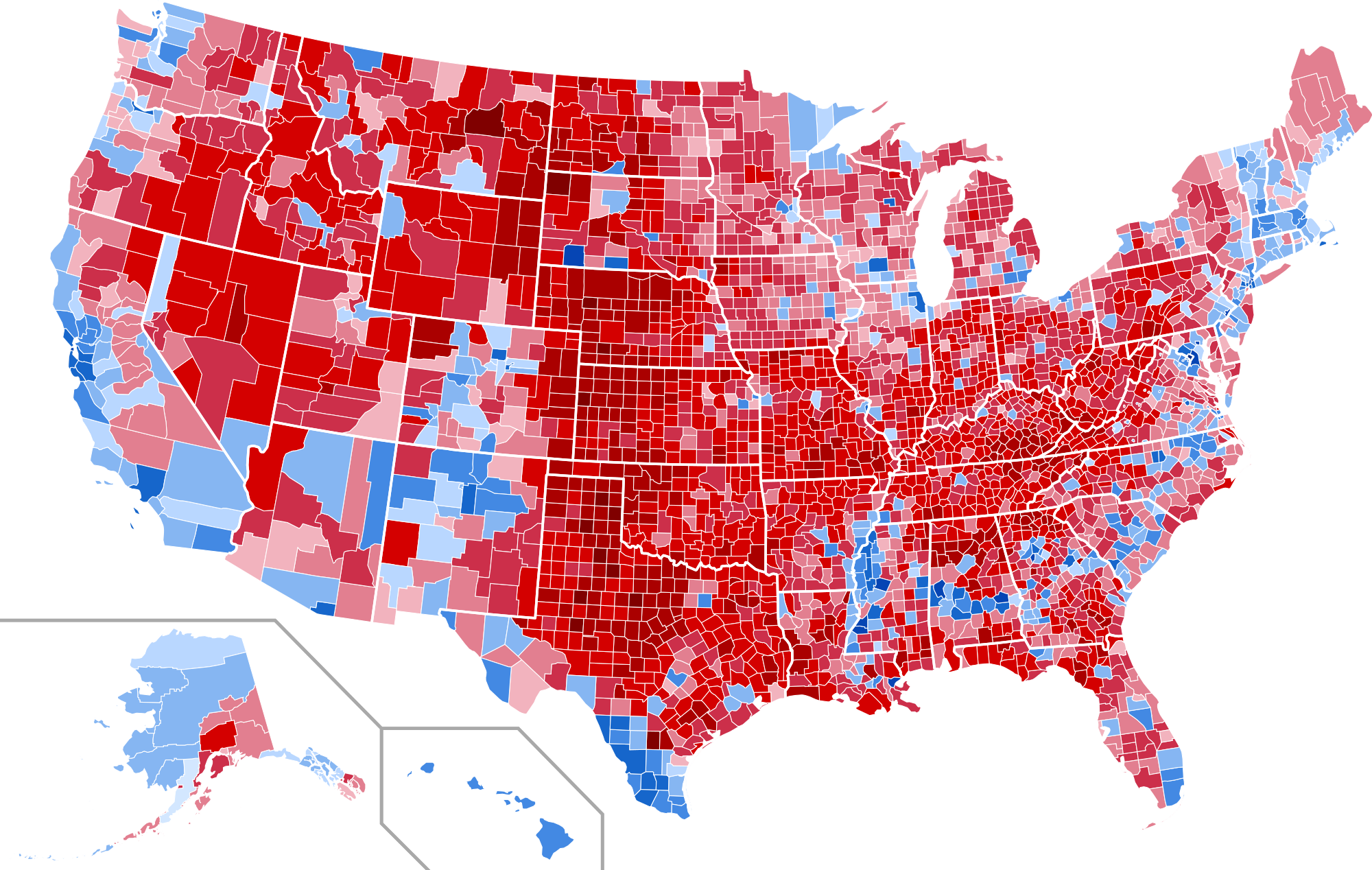
- The United States of America has an electoral college voting system and thus it does not make sense for candidates to campaign in certain states.
- For instance, It wouldn’t make sense for a democrat presidential candidate to spend a lot of time campaigning in California because the Democrat always tends to win California no matter what.
- Also, there are states where every candidate should spend their time no matter their political party because the races are usually very close. These states are called “swing states” and are states like Michigan, Ohio and Pennsylvania. However, keep in mind what’s classified as a swing state can change from election to election.
So now that we’ve covered the basics, how do we decide how much time should a candidate spend in Michigan versus Ohio? Now it gets more interesting. For instance, If we know our candidate has a huge lead in Michigan and is behind by a small margin in Ohio then it would make sense to spend more time in Ohio. So first we need to have a model to predict how people will vote.
To that end, I found a dataset on Kaggle from the Show of Hands polling app that asked about 6000 people three types of questions:
- What party they intend to vote for (e.g. Democrat or Republican)
- ~100 personal questions (e.g. Are you an idealist or are you a pragmatist?)
- Demographic information (e.g Age, Income, Education Level, marital status)
The interesting part of this dataset was the personal questions. The link between demographics and voter tendencies is perhaps more well known. However, because of the amount of personal questions that were asked of each respondent, this gives us a chance to classify voters based on personality. Of course, a quick disclaimer: Kaggle does not provide many details about the dataset beyond the app that was used to collect the data. That means, we cannot use the results of the project to make any generalizations about voters. That is also not the point of this post. The post is simply meant to describe my learnings while building a voter prediction model and I hope others will find that interesting.
Model Selection and Feature Importance:
After trying out several models, I moved forward with the random forest model because the ROC(Receiver Operating Characteristics) curve had the highest area under the curve (AUC) at 68.10%. This means that the model predicts the right political party 68.10% of the time.
Is an AUC of 68.10% “good” though? That depends on the problem I’m solving. If I was trying to beat Vegas oddsmakers and had a model that beat them 68% of the time that would be considered world class. However, for this domain that is a question I do not know the answer to. Let’s come back to this.
Once I had my model, I took a look at the feature importances to see which questions were most influential in the model’s prediction. Here are the top 13 features ordered from most impact to least:
- Are you Feminist?
- What year were you born?
- Do you personally own a gun?
- Do you meditate or pray on a daily basis?
- Are you a male or female?
- Does your life have a purpose?
- Which parent “wore the pants” in your household?
- Would you say most of the hardship in your life has been the result of circumstances beyond your own control, or has it been mostly the result of your own decisions and actions?
- People who said yes or no to being married with kids
- Did your parents spank you as a form of discipline/punishment?
- Would you rather be happy or right?
- Are you more of an idealist or a pragmatist?
- Do you live within 20 miles of a major metropolitan area?
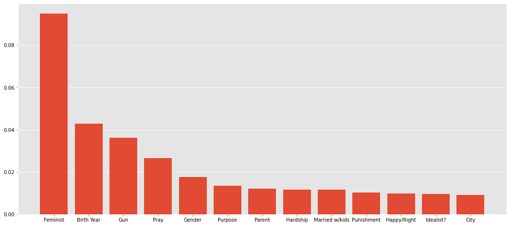
What would be driving this? Looking “under the hood” you can see why some of these features are here:
- For people who said “yes” to the question: “Are you a feminist?”, 80% of them also said they were voting Democrat For people who “yes” to the question: “Do you personally own a gun?”, 61% of them also said they were voting Republican.
- Thus, according to this sample, 39% of gun-owners intended to vote democrat. That certainly goes against conventional wisdom!
Those are two questions which divided the group of respondents the best. Ultimately, that is what feature importances show us: which answers help us divide the group into democrats or republicans the best. As you go down the list, when you split the group of people by how they answered each question the results get closer and closer to 50-50 splits.
And why might this be helpful?
Again, I’d like to say that this model should not be used to generalize anything about the U.S. population. However, let’s imagine for a second that we collected this information ourselves from a randomly sampled portion of the population and we are advising a democratic candidate. This might tell us a few things:
- Democrat voters care a lot about feminine rights. Let’s make sure to make this a big part of our campaign
- A good portion of democratic voters own a gun. Perhaps we should tread carefully with proposing certain firearm legislation.
Also, it’s interesting to note that because of the results of the “Are you a feminist?” question, my model is more confident in predicting a democrat voter rather than a republican. That’s also why one can give more advice to a democratic candidate based on these results.
Context matters:
The Random Forest model had the highest F1 score also at 67%. But is that the right scoring metric to judge the model on? Or should we aim to improve either precision or recall?
Let’s go back to the question we asked in the beginning: where should the candidate spend their time campaigning? Let’s say you find out the candidate only has a 2% lead in Ohio and a 6% lead in Michigan so you tell them to spend more time in Ohio and not worry about Michigan. If the model has too many false positives (i.e. voters who you think are going to vote for you but are actually voting for your opponent), you may actually be losing in Ohio and the race in Michigan is a lot closer than you expected. So perhaps you could lose Ohio or even both. However, if the model has a lot of false negatives then you might be winning large in both states and as a result neglect to visit a third state where you thought the candidate had no chance to win.
So how do we answer this question? How do we know whether 68% AUC is a good score for a model. Context and benchmarking. This is where domain expertise comes into play. A data science team for a candidate would know what accuracy benchmarks had been achieved in the past. They should also work on understanding which error (Type I or Type II) is more undesirable. Most likely, they would develop a confidence interval (as you see in most polls) and could for instance decide that any state where the candidate had somewhere within a -5% deficit to +5% lead would be important enough to spend time in.
Next Steps/Future Work:
So now what? A 68% F1 score shows that there is some predictive power to the model! This MVP has shown that there’s promise in this concept. However, we’d want to improve this. How might we do that? To start, we want to add voter location data to this dataset. I spent the whole blog post discussing states but we don’t even know where these voters live! Also, race/ethnicity is missing from the demographic information. Finally, we’d want to make sure to keep building domain expertise for this problem because ultimately the model can only improve as much as our knowledge and intuition improve.