Exploratory Data Analysis for NYC MTA Data (AKA Learning how to deal with outliers)
Welcome to my first blog post. I’m excited to use this platform to share learnings and commentary from my experience at the Metis Data Science bootcamp. These posts will mostly feature highlights and things I want myself to remember from doing these projects but hopefully they will be useful to other aspiring data scientists as well.
As of now, we are at the end of week 1 and we have finished our first project. The project scenario was this: An organization called WomenTechWomenYes wanted to get people to attend their annual gala in the summer and are planning on placing street teams outside subway stations to get signups. They have asked us to help them optimize the placement of their street teams so that they can gather as many signups as possible from people who would be their target audience.
This is all the direction we were given but from this it’s clear that we need to find out what the busiest subway stations are. So first we went to the MTA website to grab subway turnstile data which is easily downloadable but the data was confusing and hard to read.
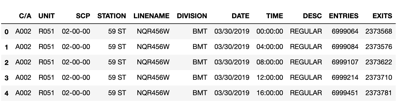
So this is the data?
As you can see above, there are many column titles that don’t mean anything to you unless you work at MTA (e.g. C/A or SCP). The worst part is the Entries and Exits columns. From investigating it, you can see that those columns are showing cumulative totals for each timestamp. For instance, on March 30th, at 4am there were 6,999,084 entries for a turnstile at 59 ST station and at 8am there were 6,999,107 entries so between 4 and 8am that day there were 23 people that entered the station through that turnstile.
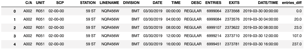
And thus, our jobs as data scientists have started. In order to find stations with a lot of traffic, we first need to generate the table showing each station and its total traffic over some time period. Since, the columns for entries and exits show cumulative totals for each timestamp, we need to find the difference between a row value and the row value directly above it to actually get the true number of entries and exits in that time period.
So we decided to find the difference between consecutive rows and pasted the values in a new column: “entries_diff”.
More Issues
However, this newly created entries_diff column had a number of problems. For one, there were incredibly large numbers that were too high to be possible. In other words, there were outliers - a common problem that data scientists run into.
But although this is a common problem, why it was happening wasn’t so obvious. The way the data is structured each row shows the entries cumulative total for a single turnstile in 4 hour increments per day. So there are 6 rows for each turnstile per day so lets say you have data for 7 days, every 42 rows the turnstile will shift so the entries and exit values will be wildly different between the rows. Thus, this differential method creates massive outliers that are incorrect.

Solution
We decided to deal with these outliers by first making the values 0. It seemed like the timestamp for most of these outlier rows were all at the beginning of the time period we were looking at so the number of entries should be zero because we haven’t started counting yet. This worked for most of the issues with the first date. However, we were looking at data over three weeks and the data was grabbed one week at a time. So at the point in the dataframe, where week 1 data ended and week 2 started or wheren week 2 ended and week 3 started there were more outliers created. These became noticeable once we got later in the task and created a table showing the total entries per station per day.
As you can see here, on March 30th, April 6th and April 13th the values look way too high. These must be outliers. So to solve this issue, we replaced any values more than 2 standard deviations with the median value for that station. This was more appropriate than making the values zero like last time. Obviously, on these dates there had to be at least “some” entries in the station and we chose to represent those dates with the median number of entries because the mean was heavily skewed by the outliers.
So after that, we were ready to display our top 20 stations in terms of entries over our three week period. As you can see below these tend to match up pretty well with top station rankings found elsewhere online.
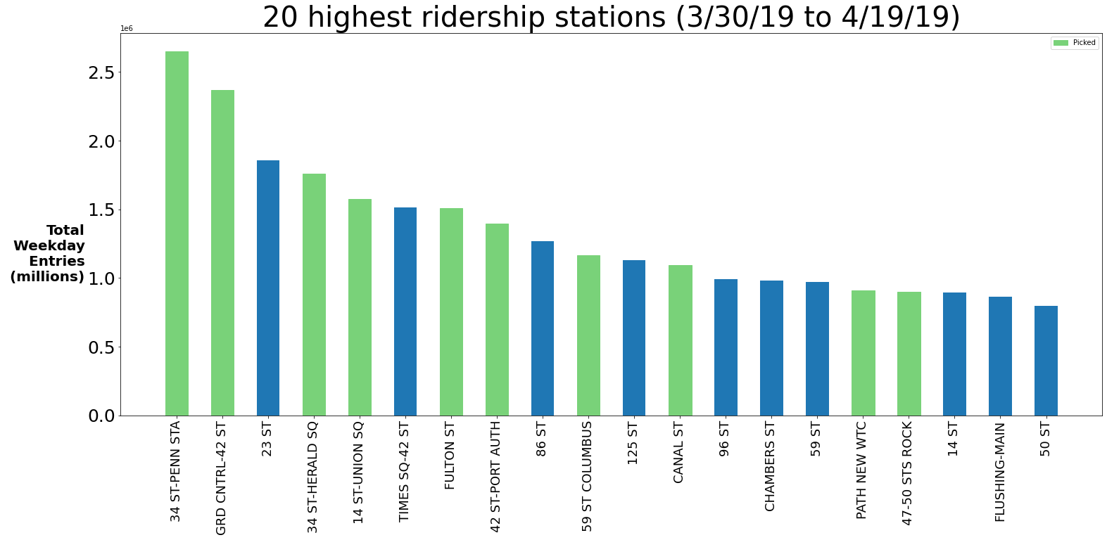
However, this was not enough. As data scientists, we need to utilize our own domain knowledge to improve our recommendations. First of all, this is a tech event so we should probably focus on subway stations near large portions of tech companies and send teams out on weekdays to make sure we’re most likely to see as many tech workers as possible. Also, as you start to understand more about the New York City subway station, it becomes apparent that some of these bars are false. For instance, the 23rd St station depicted in the chart above is a combination of several subway stations on 23rd st so you cannot count that entries total as one station. The same goes for 86 St and 125 St. After combining all of these insights we then landed on 10 stations to target for the organization’s street teams:
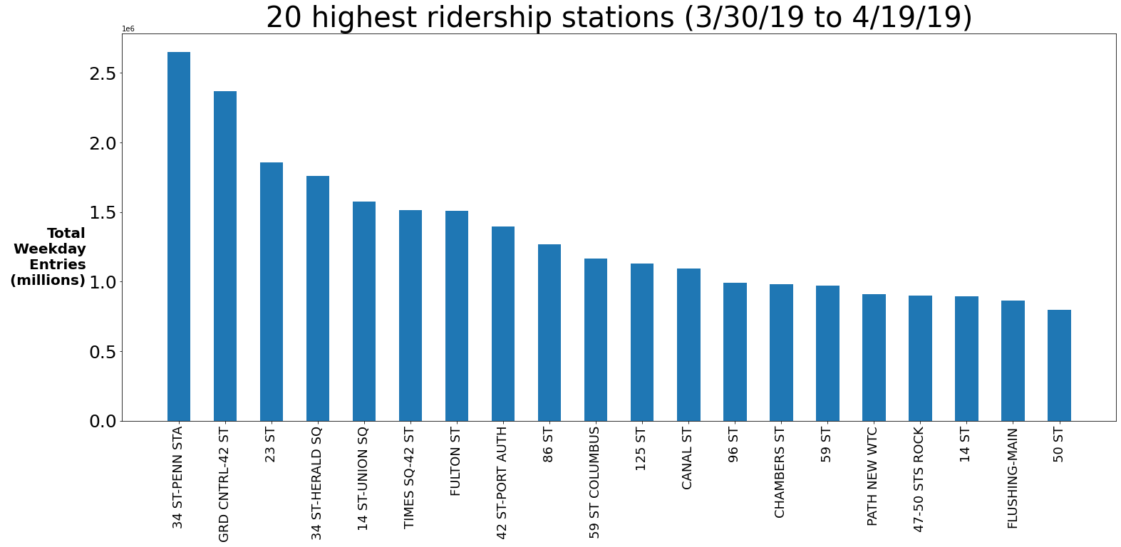
And… we’re done! Yet, despite finding an acceptable solution to the project, this was not the most interesting part of this experience for me. I learned why data science is so coveted. It’s pretty simple to learn the python necessary to find an answer. With a few pandas groupby functions and some tinkering in matplotlib we were able to produce the chart above. However, the “real work” was understanding the data, turning it into something usable, and then dealing with the outliers. You might say that even that process is pretty standard. However, for this dataset there were some unique quirks and I’m sure for other datasets there will be unique quirks that make that process uniquely difficult. A true data scientist needs to artfully combine an understanding the data and the problem (i.e. NYC subway knowledge) to enhance their analysis and make it something special. I’m looking forward to getting better at this skill!